Eterno
Santiago Reyes is a remarkable individual who embodies the American dream. Born in 1975 in the town of Guanajuato, Mexico, he immigrated to the United States at the age of 10, eventually making Houston, Texas, his hometown. A proud alumnus of the University of Texas, where he majored in business management, Santiago's entrepreneurial spirit and vision were truly ignited after a life-altering diagnosis of stage 3 lung cancer at the age of 38. During a two-year journey of recovery, Santiago found the inspiration to start his watch company, Eterno, which has since become a symbol of his tenacity and creativity.
Timeframe: 3 weeks
STUDENT PROJECT
Programs Used:
Illustrator
InDesign
Photoshop
Lightroom
BRAND IDENTITY, PUBLICATION, PACKAGE DESIGN
OVERVIEW:
TARGET MARKET:
Age: 30-70 years old
Income: 130-400k
Education: College, Entrepreneur
Personality: Enjoys fashion, Work-oriented, Cultural, Status-conscious, Collectors mentality, Knowledgable, Family-oriented
As I was designing these touchpoints, I crafted them with the intention of a modern aesthetic. According to my research, design has evolved to where now consumers associate luxury products to a clean and sleek appearance.
Gift packaging is available to customers both in-store and online for an additional fee. Additionally, they offer a custom note featuring one of the signature phrases: 'A gift as precious as time'.
STORE SIGNAGE & PACKAGING:
INTERACTIVE CATALOG SPREADS:
RESEARCH:
As I was conducting my research, I learned about the luxury watches market to gain a better understanding about the growth of businesses.
In 2024, revenue with the luxury watch industry is expected to maintain a consistent trend. Analyzing the revenue data of luxury jewelry (blue), it’s evident that there will be a slight incline in revenue, indicating a persisteant demand for jewelry items.
Based on the data, as a Graphic Designer, I can detect what the company’s value proposition.
COMPETITIVE AUDIT:
After completing my competitive audit, I discovered a common thread among them. They all have a rich history which gives them credibility in the industry. Both Breguet and Omega have left marks on the world of timepieces.
With Eterno, they don’t have this advantage since they are a newer company. The PURPOSE of the competitive audit is to help me find what the value proposition of Eterno.
What makes Eterno unique is:
They are able to create more watches than the average number being made. The average is 500 to 1,000 pieces while Eterno makes 600 to 2,000.
While most luxury timepieces are made in Switzerland and the rest of Europe, Eterno offers to showcase a new culture.
Reyes (the CEO) funds aspiring watchmakers to be apprenticed by the most skilled watch-makers in the world. This helps the company surpass the average in watch production.
PRIMARY LOGOS
SECONDARY LOGOS
FINAL LOGOS:
To begin, I thought that the use of the humming bird fit perfectly into my listed adjectives. My adjectives are bold/striking, cultural, active, and timeless. Hummingbirds are a known symbol in Mexico as well as it correlates with the speediness of time. The activeness throughout the logo, exhibits his morals, and why he even created Eterno in the first place. Reyes believes that taking care of your health is the most important as well as having hope when times get tough.
Eterno translates to eternity. Eterno means forever. Forever means it lasts and never goes out of style, just like these watches. They're not just trendy now; they'll stay stylish for generations to come.
COLOR PALLETE & TYPOGRAPHY:
Gold is often associated with luxury, wealth, and elegance. Additionally, gold is used for many jewelry pieces and it symbolizes high quality, longevity, and beauty.
The navy blue symbolizes professionalism, tradition, and introspective. Which is everything that Eterno values in their brand.
Dashiell Fine is sophisticated sans serif that has a tall x-height and unique serifs. Comparatively, Mofista also has unique serifs but its uniqueness is tied to the rendering of the humming bird. The curved and sharp angles reflect the softness and familial nature of the company.
Because of the constant use of serifs throughout the branding, I thought it was appropriate to use a sans serif font like Avenir for body copy. Avenir was built with clarity and legibility in mind. Its sleek appearance and balanced proportions give it a timeless feel. Additionally, Avenir is versatile, whether it is used in print materials, signage, or on the web.
#065A88
R: 6 G: 89 B: 135
C: 96 M: 66 Y: 25 K: 7
#171717
R: 23 G: 23 B: 23
C: 73 M: 67 Y: 65 K: 80
#FFD04B
R: 255 G: 208 B: 75
C: 0 M: 18 Y: 81 K: 0
THE PATTERN:
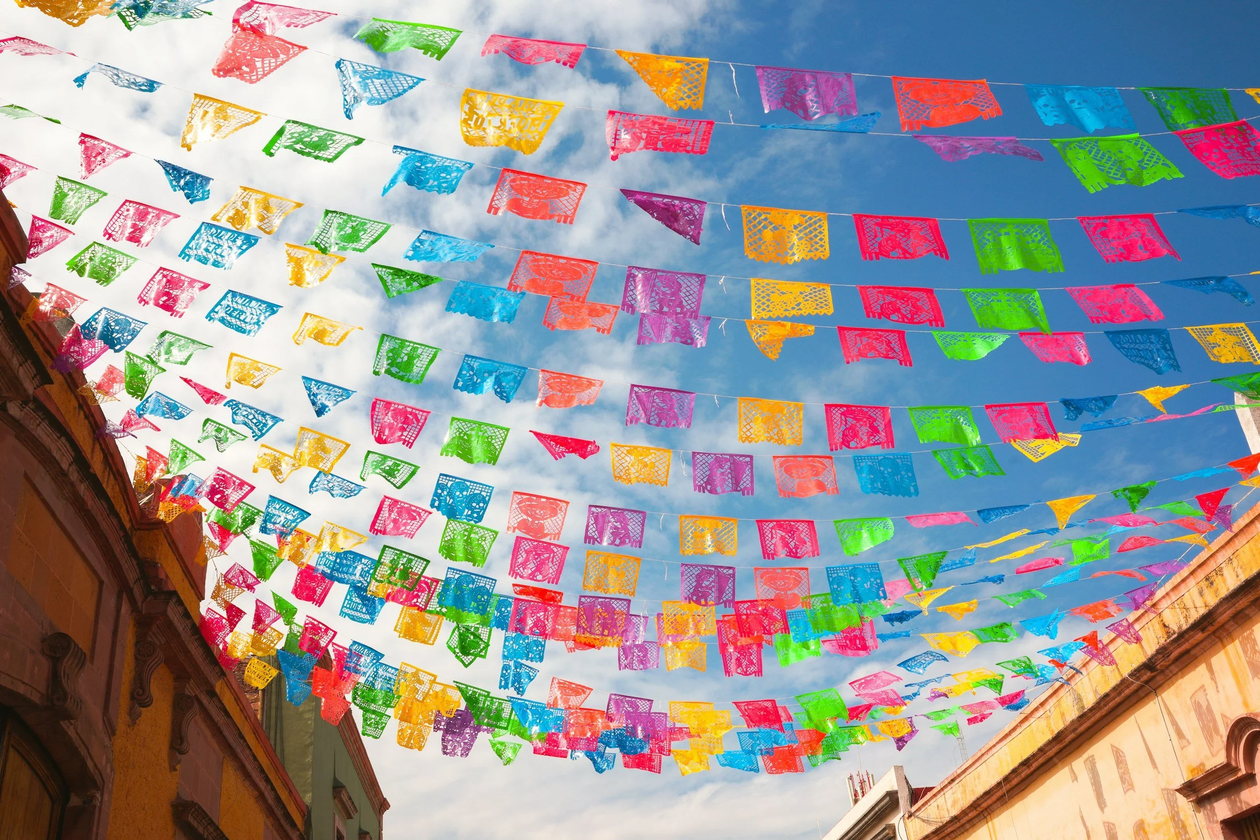
This pattern symbolizes the organic motifs used in the cut-outs of papel picado. The papel picados are popular in Reyes’ hometown of Guanajuato. The company would use this pattern on packaging and as an overlay on advertisements or marketing materials.


