Opale
Opale was established in 1990 from the rural town of Olanchito, Honduras. The Martinez family wanted to share their precious memories from the rancho and emphasize the importance of Honduran culture.
The name Opale is a term used in the town in Olanchito and it is used as a greeting like “Aye!” or “What’s up?”
Opale is a specialty craft beer that is multi-cultural, meaning that the beer can resonate amongst Hispanics and Americans.
Timeframe: 3 weeks
STUDENT PROJECT
Programs Used:
Photoshop
Illustrator
Procreate
BRANDING, PACKAGE DESIGN,
ADVERTISING, ILLUSTRATION
OVERVIEW:
TARGET MARKET:
Age: 21- 45 years old
Income: 40k-100k
Education: Highschool or College
Personality: Beer lovers, Open-minded
The GOAL for the poster advertisements is to showcase that you choose your selected beer based on the feeling or occasion. For example, if it is party time, you would drink “Pijín” or “Caliche” because they are in Giddy Up category.
The surrounding illustrations are intended to depict the categories. Utilizing sharp shapes in Giddy Up conveys a feeling of vibrancy and excitement. Additionally, the bright yellow and red colors enhance the energetic atmosphere. Conversely, using organic shapes in Kick Back reflects a sense of relaxation and calmness. The muted colors in Kick Back serve to contrast the lively vibes of Giddy Up.
You would see these around in big cities.
POSTER ADVERTISMENTS:
The GOAL of the billboard advertisement is represent the brand and what they are known for, which is their cowboys/rancheros.
BILLBOARD ADVERTISMENT:
The GOAL of the truck advertisement is illustrate where the beer comes from which is Honduras. By adding small elements like the humming bird, the man in the hammock, the instruments, and the mountains, it gives a viewer a sense of what Olanchito is like.
TRUCK ADVERTISMENT:
LOGO CONCEPT:
The ultimate logo design drew inspiration from the "Handy-Regular" font, known for its woodblock style that captures the essence of Western/Ranchero aesthetics. To enhance its rugged appeal, a distressed texture was incorporated, adding depth and character to the design.
I also wanted to capture the rhythm of “Opale” when it is spoken aloud. The pronunciation of the word has a connotation of power and authority.
LOGO ROUGHS (PROCESS)
FINAL LOGOS:
COLOR PALLETE & TYPOGRAPHY:
The dark blue is representative of the Honduran flag. It symbolizes loyalty and stability.The yellow symbolizes the vibrant climate of Honduras, reflecting the brilliance of the sun in the region.
Similar to my reasonings for the font of the logo, I wanted the supporting typography to be bold and reflect the Western aesthetic. I was also keeping in mind of the readability of the typefaces since they are going to be used on smaller packaging such as the beer can.
#FFC61A
R: 255 G: 198 B:26
C: 0 M: 22 Y: 96 K:0
#001976
R: 0 G: 25 B:118
C: 100 M: 96 Y: 22 K:17
BEER CAN PACKAGING:
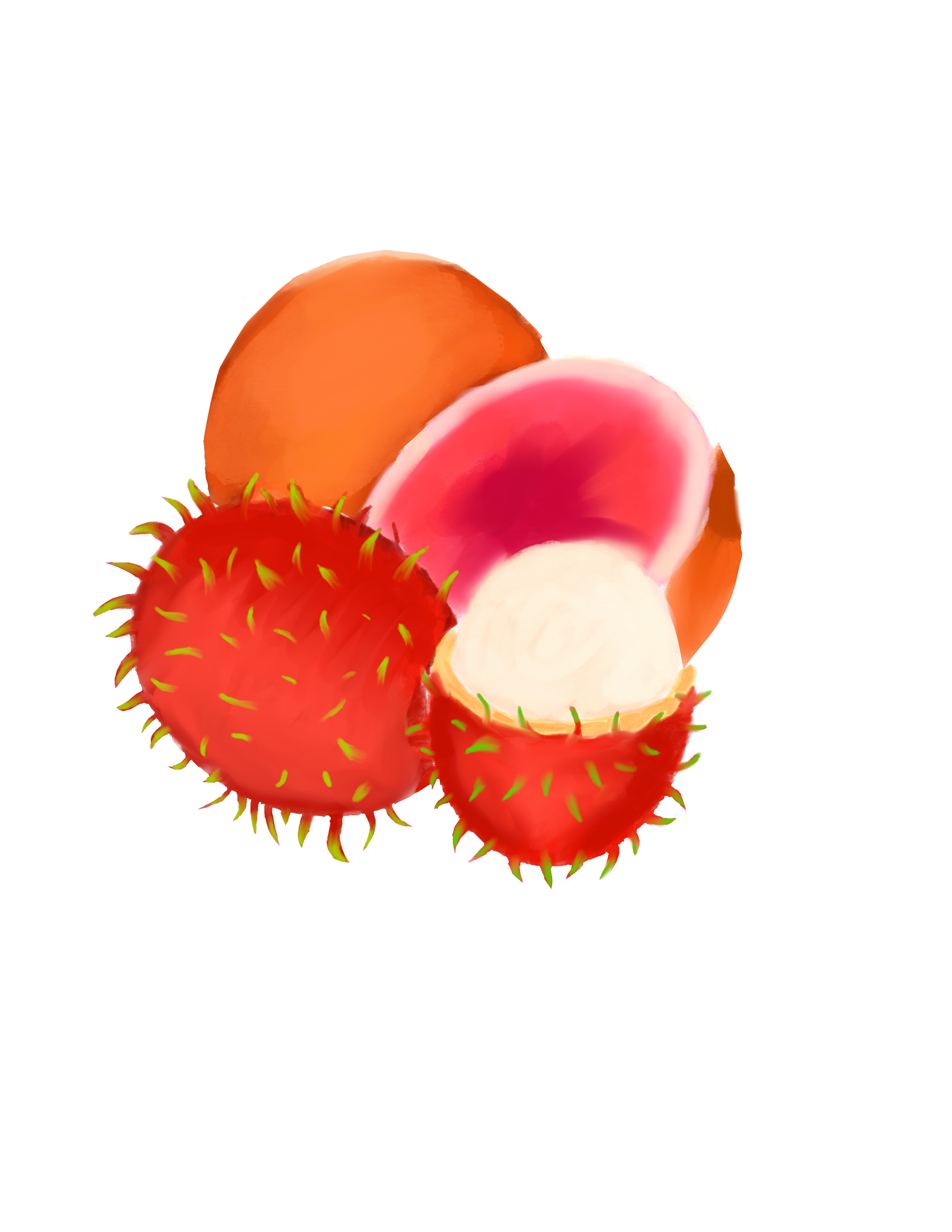
Every flavor features a unique illustration inspired by either the plant on which the fruit grows or the fruit itself. Given that some of these fruits are exotic and indigenous to Honduras, the illustrations provide consumers with visual insight into the specific fruit being depicted.


