Goodwill -Brand Refresh
Goodwill is a nonprofit organization that operates thrift stores, donation centers, and various community-based programs aimed at creating opportunities for individuals in need. They focus on employment opportunities, education, and skills training.
With the rise of fashion sustainability and ethical consumerism, Goodwill has been a favored thrift store that young people go to when seeking afforable and eco-conscious clothing options.
Timeframe: 2 weeks
STUDENT PROJECT
Programs Used:
Illustrator
Photoshop
BRAND IDENTITY, MARKETING MATERIALS, BRAND REPOSITIONING
OVERVIEW:
TARGET MARKET:
Age: 16-50 years old
Income: 5k-60k
Education: Highschool, College, or Trade-School
Personality: Eco-Conscious, Budget-Conscious, Fashionistas, Open-Minded, Socially Conscious
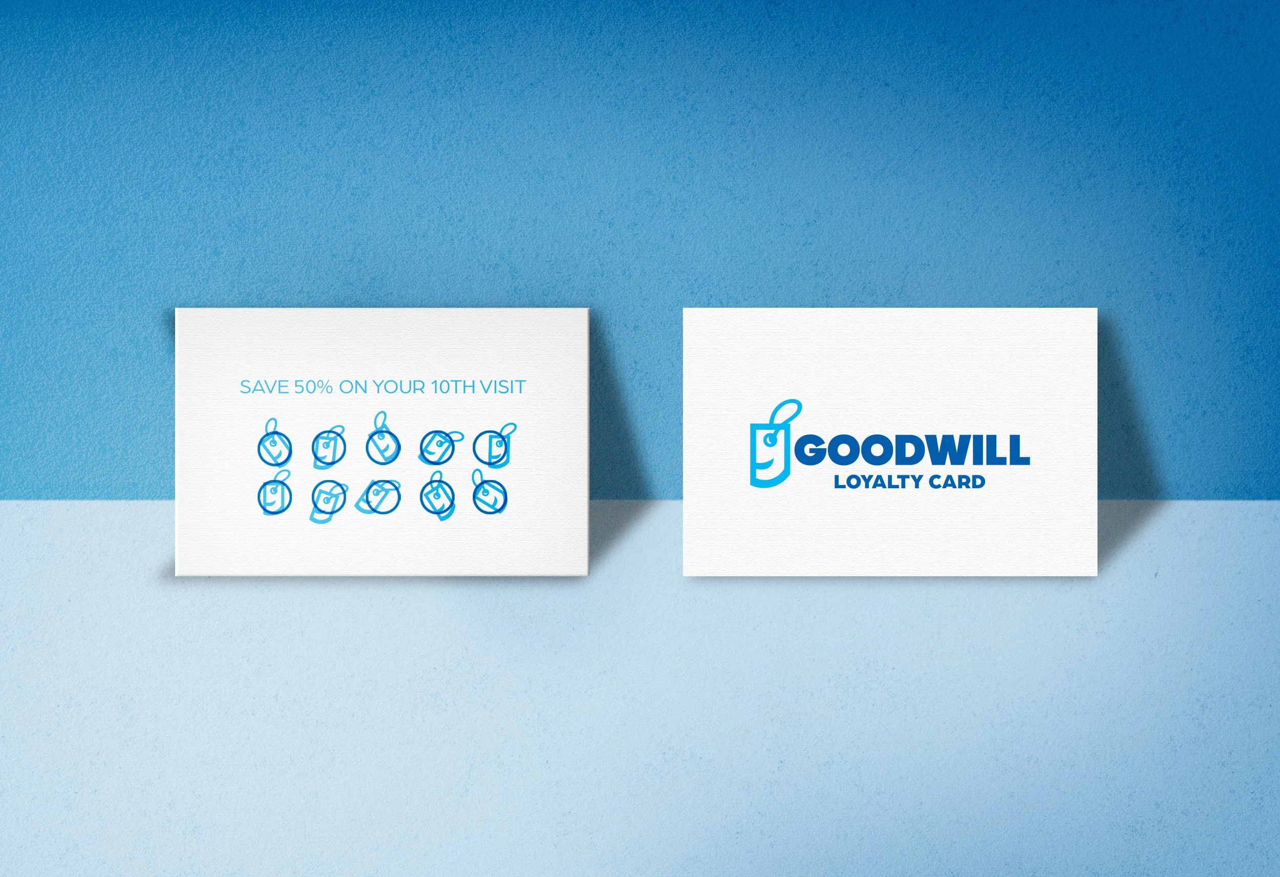
The PURPOSE of the loyalty program is to encourage people to continue shopping at Goodwill and to gain customer loyalty.
This is a marketing tool to attract new thrifters to shop there. Since the target audience is budget conscious, this is the perfect opportunity for Goodwill to push this incentive.
The icon is used as a stamp for the loyalty cards.
LOYALTY CARD:
The PURPOSE of making a design for the donation bins is crucial for Goodwill. Even though there are donation centers, proximity to donation bins increases the donation likelihood.
Since donation bins are not a specific location, it can be used as an advertising tool to promote Goodwill and encourage people to donate.
DONATION BINS:
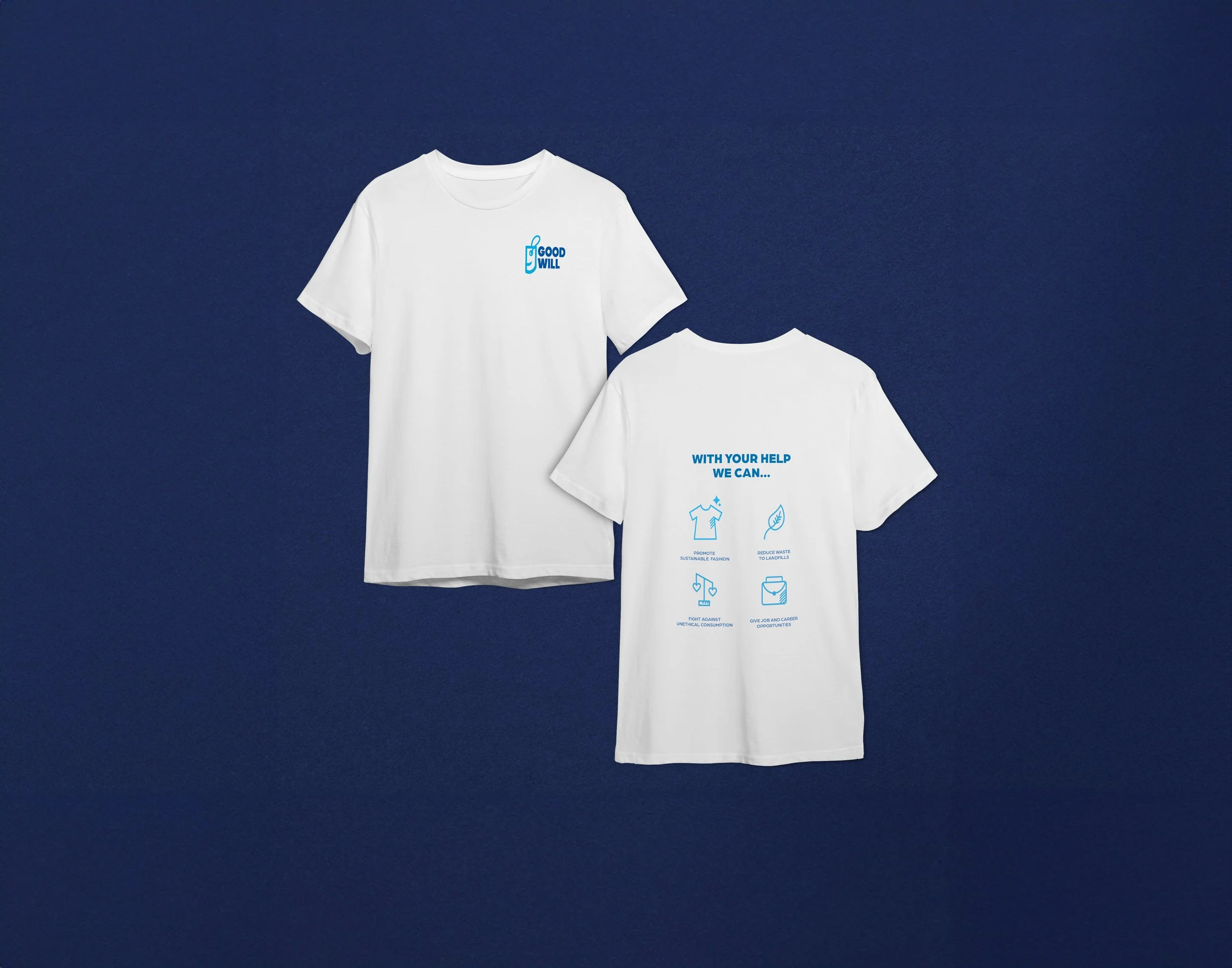
The GOAL of the uniforms is to reiterate Goodwill’s core values which is to reduce waste, and give career opportunities. I also am enforcing a new set of brand values that focus on ending unethical consumption and promoting sustainable fashion.
EMPLOYEE UNIFORMS:
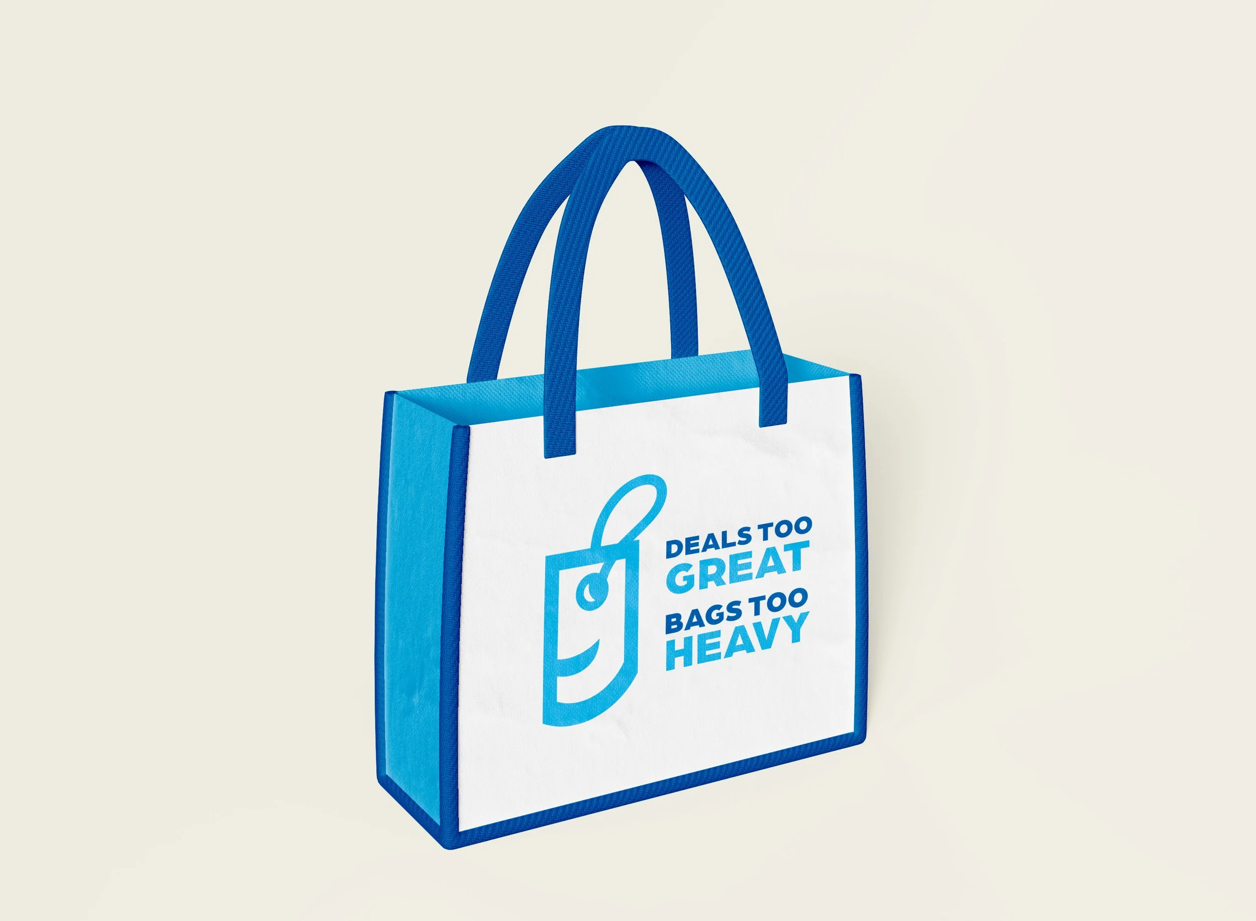
The PURPOSE of the large size reusable bag is for customers to purchase in-store and utilize it for their shopping needs. It also reemphasizes their goal of combating waste. The reusable bag offers a more environmentally friendly alternative to standard plastic bags. I wanted to make the eye of the icon look up towards the great deals that Goodwill offers.
REUSABLE BAG:
LOGO CONCEPT:
The PURPOSE of the brand refresh is to modernize the brand itself and to reposition the brand to a new market.
The original logo has remained unchanged since 1968, and while I appreciate certain aspects of the current design, such as the smile and the hidden “g”, it is becoming outdated.
Although historically thrift stores have been known to target to lower-income individuals, research shows that there has been a shift in the market. The target market who is interested in shopping at thrift stores is Millennials and Generation Z. This is because these generations are against unethical consumption and fast fashion. They care about fashion but want an affordable and environmentally friendly way to still be fashionable.
LINKS TO RESEARCH:
Patterns in Local Thrift Economies
Rise of Thrifting
ORIGINAL LOGO
LOGO THUMBNAILS
FINAL LOGOS:
The GOAL of the new logo was to show a new perspective of a non-profit thrift store which is the act of shopping, fashion, and clothing. Hence why I made a tag out of the face. The upward gaze of the eye symbolizes a a hopeful future, reinforcing Goodwill’s mission of enhancing individuals’ quality of life.
PRIMARY LOGO
SECONDARY LOGO
ICON
COLOR PALETTE & TYPOGRAPHY:
#00B7F1
R: 0 G: 183 B:241
C: 67 M: 7 Y: 0 K:0
#005DAC
R: 0 G: 93 B:172
C: 94 M: 68 Y: 0 K:0


